Plotting#
New in version 0.5.2: %sqlplot was introduced in 0.5.2; however, the underlying
Python API was introduced in 0.4.4
The most common way for plotting datasets in Python is to load them using pandas and then use matplotlib or seaborn for plotting. This approach requires loading all your data into memory which is highly inefficient, since you can easily run out of memory as you perform data transformations.
The plotting module in JupySQL runs computations in the SQL engine (database, warehouse, or embedded engine). This delegates memory management to the engine and ensures that intermediate computations do not keep eating up memory, allowing you to efficiently plot massive datasets. There are two primary use cases:
1. Plotting large remote tables
If your data is stored in a data warehouse such as Snowflake, Redshift, or BigQuery, downloading entire tables locally is extremely inefficient, and you might not even have enough memory in your laptop to load the entire dataset. With JupySQL, the data is aggregated and summarized in the warehouse, and only the summary statistics are fetched over the network. Keeping memory usage at minimum and allowing you to quickly plot entire warehouse tables efficiently.
2. Plotting large local files
If you have large .csv or .parquet files, plotting them locally is challenging. You might not have enough memory in your laptop. Furthermore, as you transform your data, those transformed datasets will consume memory, making it even more challenging. With JupySQL, loading, aggregating, and summarizing is performed in DuckDB, an embedded SQL engine; allowing you to plot larger-than-memory datasets from your laptop.
Download data#
In this example, we’ll demonstrate this second use case and query a .parquet file using DuckDB. However, the same code applies for plotting data stored in a database or data warehoouse such as Snowflake, Redshift, BigQuery, PostgreSQL, etc.
from pathlib import Path
from urllib.request import urlretrieve

url = "https://d37ci6vzurychx.cloudfront.net/trip-data/yellow_tripdata_2021-01.parquet"

if not Path("yellow_tripdata_2021-01.parquet").is_file():
    urlretrieve(url, "yellow_tripdata_2021-01.parquet")
Setup#
Note
%sqlplot requires matplotlib: pip install matplotlib and this example requires
duckdb-engine: pip install duckdb-engine
Load the extension and connect to an in-memory DuckDB database:
%load_ext sql
%sql duckdb://
We’ll be using a sample dataset that contains historical taxi data from NYC:
Data preview#
%%sql
SELECT * FROM "yellow_tripdata_2021-01.parquet" LIMIT 3
| VendorID | tpep_pickup_datetime | tpep_dropoff_datetime | passenger_count | trip_distance | RatecodeID | store_and_fwd_flag | PULocationID | DOLocationID | payment_type | fare_amount | extra | mta_tax | tip_amount | tolls_amount | improvement_surcharge | total_amount | congestion_surcharge | airport_fee |
|---|---|---|---|---|---|---|---|---|---|---|---|---|---|---|---|---|---|---|
| 1 | 2021-01-01 00:30:10 | 2021-01-01 00:36:12 | 1.0 | 2.1 | 1.0 | N | 142 | 43 | 2 | 8.0 | 3.0 | 0.5 | 0.0 | 0.0 | 0.3 | 11.8 | 2.5 | None |
| 1 | 2021-01-01 00:51:20 | 2021-01-01 00:52:19 | 1.0 | 0.2 | 1.0 | N | 238 | 151 | 2 | 3.0 | 0.5 | 0.5 | 0.0 | 0.0 | 0.3 | 4.3 | 0.0 | None |
| 1 | 2021-01-01 00:43:30 | 2021-01-01 01:11:06 | 1.0 | 14.7 | 1.0 | N | 132 | 165 | 1 | 42.0 | 0.5 | 0.5 | 8.65 | 0.0 | 0.3 | 51.95 | 0.0 | None |
ResultSet : to convert to pandas, call .DataFrame() or to polars, call .PolarsDataFrame()%%sql
SELECT COUNT(*) FROM "yellow_tripdata_2021-01.parquet"
| count_star() |
|---|
| 1369769 |
ResultSet : to convert to pandas, call .DataFrame() or to polars, call .PolarsDataFrame()Boxplot#
Note
To use %sqlplot boxplot, your SQL engine must support:
percentile_disc(...) WITHIN GROUP (ORDER BY ...)
To create a boxplot, call %sqlplot boxplot, and pass the name of the table, and the column you want to plot. Since we’re using DuckDB for this example, the table is the path to the parquet file.
%sqlplot boxplot --table yellow_tripdata_2021-01.parquet --column trip_distance
<Axes: title={'center': "'trip_distance' from 'yellow_tripdata_2021-01.parquet'"}, ylabel='trip_distance'>
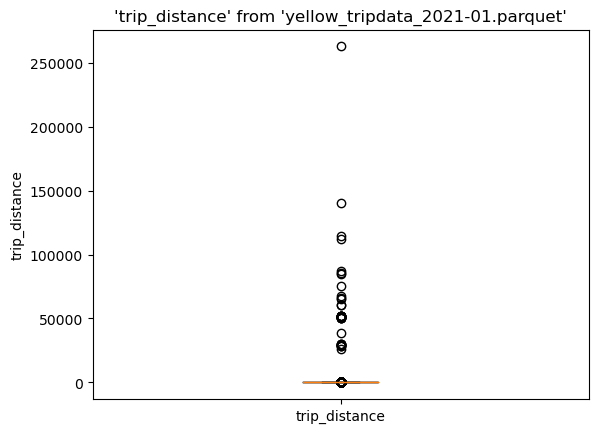
There are many outliers in the data, let’s find the 90th percentile to use it as cutoff value, this will allow us to create a cleaner visualization:
%%sql
SELECT percentile_disc(0.90) WITHIN GROUP (ORDER BY trip_distance),
FROM 'yellow_tripdata_2021-01.parquet'
| quantile_disc(0.90 ORDER BY trip_distance) |
|---|
| 6.3 |
ResultSet : to convert to pandas, call .DataFrame() or to polars, call .PolarsDataFrame()Now, let’s create a query that filters by the 90th percentile. Note that we’re using the --save, and --no-execute functions. This tells JupySQL to store the query, but skips execution. We’ll reference it in our next plotting call.
%%sql --save short_trips --no-execute
SELECT *
FROM "yellow_tripdata_2021-01.parquet"
WHERE trip_distance < 6.3
Now, let’s plot again, but this time let’s pass --table short_trips. Note that this table doesn’t exist; JupySQL will automatically infer and use the saved snippet defined above.
%sqlplot boxplot --table short_trips --column trip_distance
Plotting using saved snippet : short_trips
<Axes: title={'center': "'trip_distance' from 'short_trips'"}, ylabel='trip_distance'>
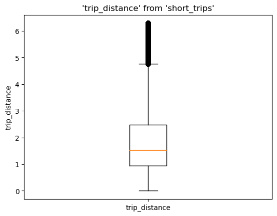
We can see the highest value is a bit over 6, that’s expected since we set a 6.3 cutoff value.
If you wish to specify the saved snippet explicitly, please use the --with argument.
Click here for more details on when to specify --with explicitly.
%sqlplot boxplot --table short_trips --column trip_distance --with short_trips
<Axes: title={'center': "'trip_distance' from 'short_trips'"}, ylabel='trip_distance'>
Histogram#
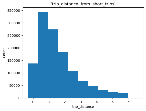
To create a histogram, call %sqlplot histogram, and pass the name of the table, the column you want to plot, and the number of bins. Similarly to what we did in the Boxplot example, JupySQL detects a saved snippet and only plots such data subset.
%sqlplot histogram --table short_trips --column trip_distance --bins 10
Plotting using saved snippet : short_trips
<Axes: title={'center': "'trip_distance' from 'short_trips'"}, xlabel='trip_distance', ylabel='Count'>
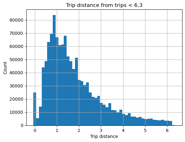
Customize plot#
%sqlplot returns a matplotlib.Axes object that you can further customize:
ax = %sqlplot histogram --table short_trips --column trip_distance --bins 50
ax.grid()
ax.set_title("Trip distance from trips < 6.3")
_ = ax.set_xlabel("Trip distance")
Plotting using saved snippet : short_trips
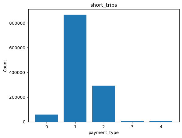
Bar plot#
To create a bar plot, call %sqlplot bar, and pass the name of the table and the column you want to plot. We will use the snippet created in the Boxplot example and JupySQL will plot for that subset of data.
%sqlplot bar --table short_trips --column payment_type
Plotting using saved snippet : short_trips
Removing NULLs, if there exists any from payment_type
<Axes: title={'center': 'short_trips'}, xlabel='payment_type', ylabel='Count'>
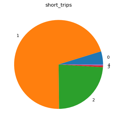
Pie plot#
To create a pie plot, call %sqlplot pie, and pass the name of the table and the column you want to plot. We will reuse the code snippet from the previous example on Boxplot, and JupySQL will generate a plot for that specific subset of data.
%sqlplot pie --table short_trips --column payment_type
Plotting using saved snippet : short_trips
Removing NULLs, if there exists any from payment_type
<Axes: title={'center': 'short_trips'}>